

- Dynamics 365 F&O
- X++
- JavaScript
- Extensible controls
- AX 2012 upgrade
Calendar week numbers in the D365 F&O date picker
AX 2012 showed calendar weeks in its date lookup, D365 F&O does not. How I added ISO week numbers to every date picker with X++ and JavaScript.

On this page+
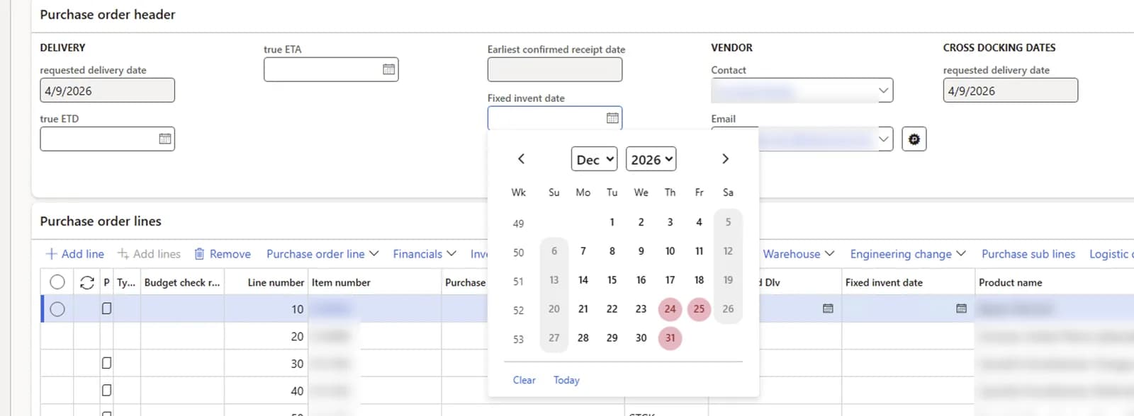
On a customer project moving from Dynamics AX 2012 to Dynamics 365 Finance and Operations, we got a requirement that sounds small: show calendar week numbers in the date picker. The purchasing and logistics teams plan deliveries by week. In AX 2012 the date lookup showed the week number at the start of every row, and they used it all day. In D365 F&O it is gone, and there is no setting to bring it back. Microsoft has an idea for it from 2019 that is still open.
This post shows how I added ISO week numbers to every date picker in the web client, with one X++ extensible control and a small JavaScript file. All the code is below, so you can use it in your own project.
Why there is no property to switch on
In AX 2012 the week numbers were one property on the SysDateLookUp form: ShowRowLabels = Yes on the days table. My first idea was to find the same form in D365 F&O. It exists, but the web client does not use it for the normal date picker.
The D365 F&O date picker is pure client code, and there are two of them:
- Date fields on forms and dialogs use a jQuery UI datepicker. jQuery UI has
showWeek,weekHeaderandcalculateWeekbuilt in. The standard client never sets them. - Date cells in grids use a React date picker from the grid control library. That class is private, has no week option, and does not use jQuery at all.
So one fix has to cover both. I found this by reading the client scripts in PackagesLocalDirectory/bin/DesignTimePreview/Scripts before writing any code. That saved me from building a replacement picker.
The approach
An invisible extensible control
An event handler on FormRun.onFormRun
Form fields: switch on what jQuery UI already has
showWeek, the localized header text and the week calculation.Grids: mark the rows, let CSS draw
MutationObserver watches for an open grid date picker. It writes the week number into a data- attribute on the first cell of each row, and CSS draws it with ::before. The table structure is never changed, so the React component does not notice anything.If a platform update changes the client internals, the worst case is that the week numbers disappear. Nothing else breaks.
The solution has seven objects:
BALCalendarWeekNumbersBuild
X++ class
Design time part of the control.
BALCalendarWeekNumbersControl
X++ class
Run time control, adds itself to a form.
BALFormRunEventHandler
X++ class
Subscribes to FormRun.onFormRun.
BALCalendarWeekNumbers.htm
Resource
Control template, loads script, styles and label.
BALCalendarWeekNumbers.js
Resource
Week logic for both pickers.
BALCalendarWeekNumbers.css
Resource
Layout of the week column.
BALCalendarWeek
Label file
Column header: KW in German, Wk in English.
The X++ part
The build class
The build class only has to exist and carry the attribute that links it to the control name.
/// <summary>/// The build class for the calendar week numbers control./// </summary>[FormDesignControlAttribute("BALCalendarWeekNumbers")]public class BALCalendarWeekNumbersBuild extends FormBuildControl{}The control
The control points to its HTML resource. The static addToForm method adds it to a form once, and skips fact boxes so it is not added many times on the same page.
/// <summary>/// Invisible control that enables calendar week numbers in all date pickers of the web client session./// </summary>[FormControlAttribute("BALCalendarWeekNumbers", "/resources/html/BALCalendarWeekNumbers", classStr(BALCalendarWeekNumbersBuild))]public class BALCalendarWeekNumbersControl extends FormTemplateControl{ private const str ControlName = "__BALCalendarWeekNumbers"; protected void new(FormBuildControl _build, FormRun _formRun) { super(_build, _formRun); this.setTemplateId("BALCalendarWeekNumbers"); this.setResourceBundleName("/resources/html/BALCalendarWeekNumbers"); } /// <summary> /// Adds the control to a form at run time, so that week numbers are enabled in every web client /// session, independent of the start page. /// </summary> /// <param name = "_formRun">The form instance.</param> public static void addToForm(FormRun _formRun) { FormDesign formDesign; if (!_formRun || _formRun.isFactBox()) { return; } formDesign = _formRun.design(); if (formDesign && !formDesign.controlName(ControlName)) { formDesign.addControlEx(classStr(BALCalendarWeekNumbersControl), ControlName); } }}The event handler
onFormRun is a static delegate on a kernel class, so an event handler is the only option here. If your model already has a handler class for FormRun, put the method there instead of creating a new class.
/// <summary>/// Events that apply to all form instances./// </summary>public class BALFormRunEventHandler{ /// <summary> /// Adds the calendar week numbers control before the form is run. /// </summary> /// <param name = "_formRun">The form instance.</param> [SubscribesTo(classStr(FormRun), staticDelegateStr(FormRun, onFormRun))] public static void FormRun_onFormRun(FormRun _formRun) { BALCalendarWeekNumbersControl::addToForm(_formRun); }}The resources
Add the three files as resources to the project in Visual Studio (Add, New item, Resource). The browser loads them by file name, under /resources/html/, /resources/scripts/ and /resources/styles/.
HTML template
The template loads the CSS, the script and the label file in the language of the user. The div itself is hidden.
<link rel="stylesheet" type="text/css" href="/resources/styles/BALCalendarWeekNumbers.css" /><script src="/resources/scripts/BALCalendarWeekNumbers.js"></script><script src="/resources/labels/BALCalendarWeek.js"></script><div id="BALCalendarWeekNumbers" class="balCalendarWeekNumbers" data-dyn-bind=" visible: $data.Visible, attr: { name: $data.Name }, sizing: $dyn.layout.sizing($data)"></div>Labels
The header text comes from a label, read in the browser with $dyn.label, the same way standard controls do it. Use a small label file of its own for this. The URL /resources/labels/<file>.js sends the whole label file to the browser, and a big project label file can easily be a few hundred KB.
BALCalendarWeek.en-US.label.txtWeekHeader=Wk ;Header of the week number column in date pickersBALCalendarWeek.de.label.txtWeekHeader=KW ;Header of the week number column in date pickersJavaScript
This is the core. weekOfRow is used by both pickers, so a form field and a grid always show the same number for the same row.
(function () { 'use strict'; var datePickerSelector = '.dyn-datePicker'; var weekTableClass = 'balCalendarWeekTable'; var weekAttribute = 'data-bal-calendar-week'; var weekColorProperty = '--bal-calendar-week-color'; // Label @BALCalendarWeek:WeekHeader, loaded by the HTML resource in the language of the user. var weekHeaderLabel = 'BALCalendarWeek_WeekHeader'; var daysPerWeek = 7; var millisecondsPerDay = 86400000; var weekHeaderText; var initialized = false; var markPending = false; // Returns the ISO 8601 week number of a local date. function isoWeek(date) { var thursday = new Date(Date.UTC(date.getFullYear(), date.getMonth(), date.getDate())); var yearStart; thursday.setUTCDate(thursday.getUTCDate() + 4 - (thursday.getUTCDay() || daysPerWeek)); yearStart = Date.UTC(thursday.getUTCFullYear(), 0, 1); return Math.ceil(((thursday - yearStart) / millisecondsPerDay + 1) / daysPerWeek); } // A calendar row is labelled with the week of its Monday. Both pickers use this function, // so a row shows the same number in a form field and in a grid for every first day of the week. function weekOfRow(firstDateOfRow) { var monday = new Date(firstDateOfRow.getFullYear(), firstDateOfRow.getMonth(), firstDateOfRow.getDate()); monday.setDate(monday.getDate() + (daysPerWeek + 1 - monday.getDay()) % daysPerWeek); return isoWeek(monday); } // Parses a date in the format YYYY-MM-DD as a local date. function parseIsoDate(dateText) { var parts = dateText.split('-'); return new Date(+parts[0], +parts[1] - 1, +parts[2]); } // Week numbers for the jQuery UI date pickers (date fields on forms and dialogs). // jQuery UI calls calculateWeek with the first date of each calendar row. function enableJQueryWeekNumbers() { if (typeof $ === 'undefined' || !$.datepicker) { return; } $.datepicker.setDefaults({ showWeek: true, weekHeader: weekHeaderText, calculateWeek: weekOfRow }); } function setWeekAttribute(cell, value) { if (!value) { if (cell.hasAttribute(weekAttribute)) { cell.removeAttribute(weekAttribute); } } else if (cell.getAttribute(weekAttribute) !== value) { cell.setAttribute(weekAttribute, value); } } function hasVisibleDay(datedCells) { return Array.prototype.some.call(datedCells, function (cell) { return !!cell.textContent; }); } // The week number is drawn inside the first day cell and would inherit its colour, which is white // on the selected day and grey on a day of another month. It gets the colour of the header instead. function setWeekColor(table) { var header = table.querySelector('thead'); var color = header ? window.getComputedStyle(header).color : ''; if (color && table.style.getPropertyValue(weekColorProperty) !== color) { table.style.setProperty(weekColorProperty, color); } } function markRow(row) { var cells = row.children; var datedCells = row.querySelectorAll('[data-date]'); if (!cells.length) { return; } if (!datedCells.length) { if (cells.length === daysPerWeek) { setWeekAttribute(cells[0], weekHeaderText); } return; } // The grid picker appends a row without visible days when the month ends on the last weekday. if (!hasVisibleDay(datedCells)) { setWeekAttribute(cells[0], ''); return; } setWeekAttribute(cells[0], String(weekOfRow(parseIsoDate(datedCells[0].getAttribute('data-date'))))); } // Week numbers for the date pickers of the grid control. The week number is written as an attribute // on the first cell of each row and rendered by CSS, the table structure itself is not changed. function markDatePickers() { var tables = document.querySelectorAll(datePickerSelector + ' table'); Array.prototype.forEach.call(tables, function (table) { if (!table.querySelector('[data-date]')) { return; } if (!table.classList.contains(weekTableClass)) { table.classList.add(weekTableClass); } setWeekColor(table); Array.prototype.forEach.call(table.querySelectorAll('tr'), markRow); }); } // Marks the open grid date pickers at most once per animation frame; returns immediately if none is open. function scheduleMark() { if (markPending) { return; } markPending = true; window.requestAnimationFrame(function () { markPending = false; if (document.querySelector(datePickerSelector)) { markDatePickers(); } }); } // The grid picker changes data-date on every cell when the month changes, // so text changes do not have to be observed. function observeDatePickers() { new MutationObserver(scheduleMark).observe(document.body, { childList: true, subtree: true, attributes: true, attributeFilter: ['data-date'] }); scheduleMark(); } // Runs once per browser page, with the first form that carries the control. function initialize() { if (initialized) { return; } initialized = true; weekHeaderText = $dyn.label(weekHeaderLabel); enableJQueryWeekNumbers(); observeDatePickers(); } $dyn.ui.defaults.BALCalendarWeekNumbers = {}; $dyn.controls.BALCalendarWeekNumbers = function (data, element) { var self = this; $dyn.ui.Control.apply(self, arguments); $dyn.ui.applyDefaults(self, data, $dyn.ui.defaults.BALCalendarWeekNumbers); initialize(); }; $dyn.controls.BALCalendarWeekNumbers.prototype = $dyn.extendPrototype($dyn.ui.Control.prototype, {});})();CSS
.balCalendarWeekNumbers { display: none;}/* jQuery UI date pickers (date fields on forms and dialogs) */.ui-datepicker td.ui-datepicker-week-col { vertical-align: middle; text-align: center; padding-right: 8px; opacity: 0.7;}.ui-datepicker th.ui-datepicker-week-col { text-align: center; padding-right: 8px; font-weight: normal;}/* Grid date pickers: the week number is rendered from the data-bal-calendar-week attribute of the first cell */.balCalendarWeekTable { margin-left: 30px;}.balCalendarWeekTable [data-bal-calendar-week] { position: relative;}.balCalendarWeekTable [data-bal-calendar-week]::before { content: attr(data-bal-calendar-week); color: var(--bal-calendar-week-color); position: absolute; left: -32px; width: 26px; text-align: center; opacity: 0.7; font-weight: normal; pointer-events: none;}Testing it in the browser
Build the model, then open any form in the web client with the browser developer tools open. On the Network tab, turn on Disable cache. Otherwise the browser keeps serving an old copy of the script and you keep testing yesterday's version. After a reload you should see the HTML, CSS and JS resources of the control being loaded, and the week column in every date picker you open.
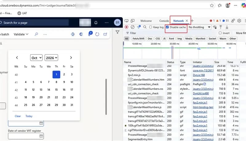
Things worth checking:
- A date field on a form, a date field in a dialog and a date cell in a grid. These are the two different pickers.
- A user whose week starts on Sunday (user options, date format) and one whose week starts on Monday.
- A month that ends on the last day of the week, for example May 2026.
- The selected day and days of the previous or next month, in light and dark theme.
Details that took the most time
Sunday first users. jQuery UI calls calculateWeek with the first date of each row. For a user whose week starts on Sunday, that is a Sunday, and the ISO week of a Sunday belongs to the previous week. So a form field showed 40 while the grid showed 41 for the same row. The fix is weekOfRow: both pickers take the week of the Monday in that row.
An empty last row. The grid picker adds a row without visible days when a month ends on the last weekday. Without a check, that empty row got a week number. hasVisibleDay skips it.
The invisible number. The number is drawn inside the first day cell, so it took that cell's text colour. On the selected day that is white on white, and on days of another month it is grey. The script copies the header colour into the CSS variable --bal-calendar-week-color, so the number always looks like the header.
ISO weeks only. The code uses ISO 8601 weeks (week 1 contains the first Thursday of the year), which is what German and most European users expect. AX 2012 followed the Windows regional settings, which gives the same result for German settings. If your users need US style week numbers, change isoWeek.
Summary
Three X++ classes, three resource files and one label, about 300 lines in total, and the users have their week numbers back in every date picker. No standard form was changed and no form needs its own code.
If you want this in the standard product, vote for the Microsoft idea. If you need help moving from AX 2012 to D365 F&O, or with a gap like this one, talk to us.
